
I’m getting closer to publishing my book. I can see the finish line. It feels like the final mile of a marathon. The hard work of writing, and multiple revisions, are mostly done. One final revision lies ahead. (I love revising.) Also, creating a cover, including the blurb(s) and short author bio that go there. Oh, and formatting the final manuscript, so it prints as desired. All of these last steps are, for me, the most fun. It’s been a long journey, one step after another, making slow and sometimes painful progress. Crossing the finish line will be a personal victory, and a relief. All my hard work, rewarded.
For the month of November, my manuscript has been in the sure and trusted hands of my friend and professional editor, Susan. Her jumping in at this stage to do the copy editing, when I needed her most, was a wonderful and welcome surprise. Susan’s been in my corner for years. We met nearly twenty years ago. She edited all of my articles for The Bark magazine. As I told Susan over those years, ad nauseam, her edits made me sound way smarter than I am. That ongoing working relationship developed into a friendship I cherish, surviving beyond the magazine’s sale.
The final revision, incorporating Susan’s edits, will be easy. I always adopt her edits.
In addition to doing the copy editing, Susan steered me toward a book cover designer after I shared I was having trouble finding someone. Initially, I tried tracking down the woman who designed the cover of my first book, Growing Up Boeing. I couldn’t find her. Not too surprising, as that was ten years ago.
Hiring some unknown person online, e.g., through Reedsy, felt risky to me.
Susan’s daughter is a published author. Susan gave me the name and contact info for the woman who designed her covers. Jane Dixon-Smith lives in the United Kingdom, but location doesn’t matter. A knowledge of cover design, including the specifications required for publishing on KDP (Kindle Direct Publishing, formerly CreateSpace), does. Jane also does formatting.
I reached out to Jane and was delighted to learn she could help me. Within another week, we started the process.
First, Jane wanted me to send her ten book covers in my genre (nonfiction) that I liked, or that had elements I envisioned for my own book. That was an interesting exercise, one anyone contemplating the cover of their own book should do. I sent Jane ten examples via email, with links to the books’ Amazon pages and brief explanations why I liked them.
I also sent Jane a short description of my book’s title, subtitle, content, a blurb, and some ideas I had for the cover.
Jane then searched for stock images that met my criteria. I also sent Jane some of my own images. Of the stock images—most of them of Idaho mountains, usually the Sawtooths—Jane asked me to select my favorites.
Soon, a selection of five sample covers arrived in my inbox. Two used my images, three used stock images she found.
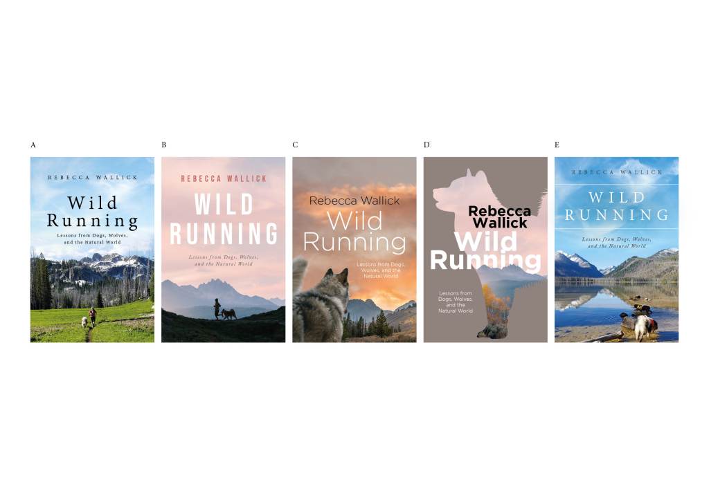
I shared those images on my personal Facebook page, asking my friends to provide feedback. That was fascinating and enlightening. Covers A & E, using my own photos, were deemed too personal, or too much like a regional hiking guide cover. I had to agree. I nixed those two.
Friends made useful comments on details, e.g., pink sky (B) vs orange sky (C); use of silhouettes (B & D); the power of the dog’s viewpoint (C). There was a clear overall favorite: B. Thankfully, that was my favorite, as well as Jane’s. Idaho’s Sawtooth Mountains form the background. Idaho is where much of my story occurs.
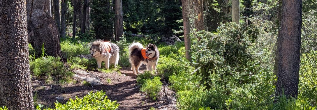
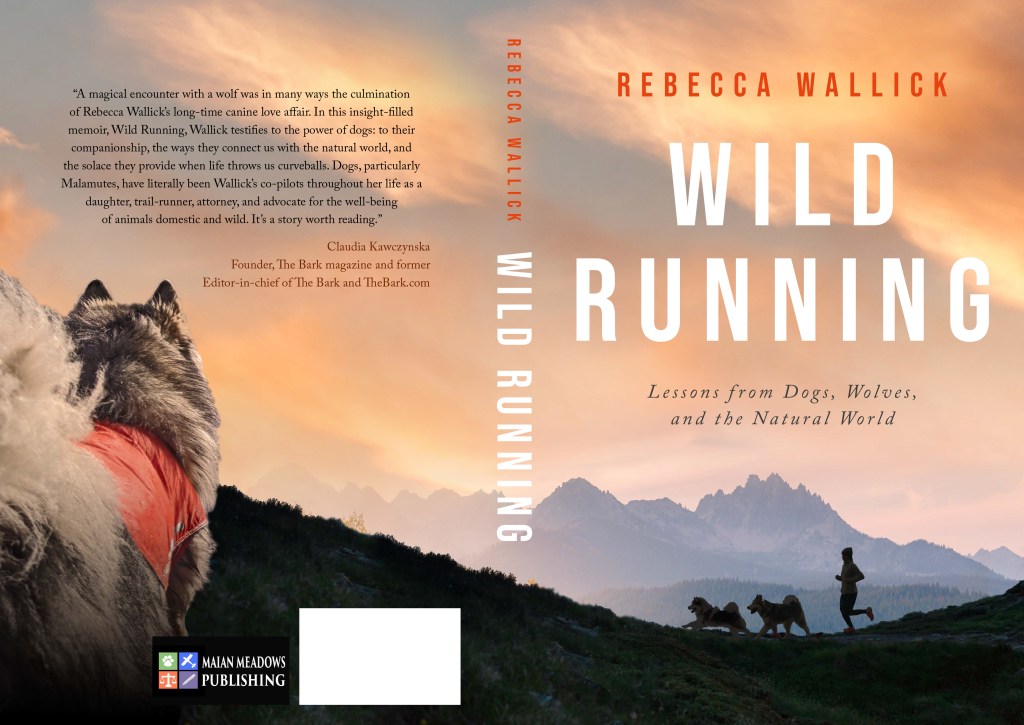
I thought about all the feedback for a few days. I sent Jane my preferences for refining the cover: use cover B, but with the orange sky of C; change the runner + dog silhouette to two dogs + runner (truer to my life experience); incorporate elements of cover C (dog’s perspective) into the back cover by carrying over the orange sky from front to back. I found a photo of Conall and wondered if Jane could substitute him for the random stock dog photo (on cover C) into the back cover? The photo of Conall shows him wearing an orange vest, something that comes up frequently in the book.
A few days later, two mock ups of the front cover arrived in my inbox: one with pink sky, one with orange. Both had an updated silhouette of two dogs + runner.
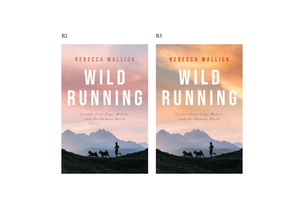
Again, I posted to my personal Facebook page and asked for feedback. As before, the comments were enlightening. Many associated the pink sky with sunrise, the orange with sunset. I do, too. I always run in the morning, so the pink sky held personal appeal. (Sadly, toward the end my stay in Idaho, orange skies were too common, as more wildfires burned.) But, more friends commented that the orange sky felt warmer, was more eye-catching, and made the text easier to read.
Orange it would be.
I gave Jane the results of my informal survey and said I wanted an orange sky.
The next email from Jane provided this mock up of the front and back covers. She was able to substitute the photo of Conall for the random dog!
Getting there! It’s starting to feel real.
We’re now in a holding pattern on cover design. After I get Susan’s edits, I’ll send the manuscript to two people I’ve lined up to read and provide blurbs. One’s an expert on studying wolves in Minnesota, the other is a trail runner/well-known writer in the ultra running community. I’m also waiting for some other blurbs to arrive, and seeking more. (Blurbs that don’t make the cover can become reviews on a book’s Amazon page.) I want to have the best possible blurb, or blurbs/excerpts, on the cover, although the one that’s on the mock up, from Claudia Kawczynska, former Editor-in-chief the The Bark magazine, is darn good.
Once I settle on cover blurbs, and seek a few minor tweaks to cover elements (e.g, adding “A Memoir” under the subtitle), I’ll have a cover I love. So exciting.
A good cover is critical, especially for someone like me, self-published and doing her own marketing.
Why?
In a metaphorical sense, a book cover is also a frame around the text and a bridge between text and world. The cover functions simultaneously as an invitation to potential readers and as an entryway into the universe that the writer has created, whether fictional, historical, autobiographical, or otherwise. Come, it says, join the party—or at least save the date.
Peter Mendelsund and David J. Alworth, What a Book Cover Can Do, https://lithub.com/what-a-book-cover-can-do/
The cover is the potential reader’s first clue to what hides within. It tells them whether it’s a topic they’re interested in, whether it’s worth risking their money to buy the book. For self-publishers, the vast majority of sales are online. Few sales occur in bookstores. I know that’s true based on my experience with Growing Up Boeing.
So, a cover has to quickly catch the reader’s eye, make them stop scrolling through the multitude of book options available to them on Amazon in any given category. Me! Come take a closer look. Pick me!, you want your cover to scream. One out of six books purchased in the U.S. are e-books, where the potential reader sees only the front cover. That cover must tantalize, offering sufficient clues to make them stop long enough to read the book’s description, author info, reviews, and then—one hopes—click “Buy.”
I hope my cover evokes: a memoir about trail running with dogs in the wilderness, enveloped in nature, awe, and self-discovery.
Blurbs are a key part of what entices buyers. They can be part of both front and back covers. If only on the back cover (i.e., something e-book purchases will never see), they can be repeated in text on the book’s Amazon page.
So, I am again (still?) practicing patience. This time, waiting for final edits, blurbs, and cover. My publishing timeline goal has been pushed, but I’m completely fine with that.
Anything worth doing, is worth doing right.
Hunter S. Thompson
***
For those interested in learning more about what makes a successful book cover, I found some useful articles/blog posts on a website called Crowdspring.
Before I found Jane, while researching online sources for book covers designers, Crowdspring didn’t come up in any of my searches. Not sure why. While I’m completely happy with Jane, and highly recommend her, finding her was pure luck. If I had to start from scratch, without a personal referral to a specific designer, I’d probably give Crowdspring a go over Reedsy or Fiverr, where you have to pick a designer up front and hope they deliver something you like after a limited number of revisions. With Crowdspring, you submit a request for a design for something (logo, book cover, packaging, etc.), and designers compete for your project by proposing designs that you can tweak.
Caveat: I haven’t used any of these resources, so proceed with caution. Hiring a book cover designer is not cheap, but it’s money well spent given the important role a cover plays in sales.

Looks great, well done.
LikeLiked by 1 person
Thanks, Jeff!
LikeLike
holy cow…the cover/back looks great and LOVED the deep dive into design decisions and all about book sales etc. you can see the that light. Congratulations and you have a sale here when it’s ready to go.
LikeLike
shelle is the above anonymous writer.
LikeLiked by 1 person
Thank you! It’s a fun process, one I wanted other potential authors to consider.
LikeLike
Congratulations. It must feel very nice to be in the last lap, so to say. That’s a lovely cover (front and back).
LikeLiked by 1 person
Thank you!
LikeLike
A good cover is crucial. It’s basically make or break when it comes to interesting a reader … and I have to say I think you’ve nailed it. This looks perfect! Congrats on getting to the home stretch.
❤️
LikeLiked by 1 person
Thank you! It’s been a fun, exciting process, this cover. I’m happy.
LikeLiked by 1 person
The cover is beautiful! Option B definitely would have been my choice, and incorporating Conall on the back was a brilliant idea. For the color, I might have gone with pink, but orange also works well. Very exciting!
LikeLiked by 1 person
Thank you, Brad! It was a tough choice between pink (my fav) and orange. The better visibility of words won out.
LikeLiked by 1 person
Looks great! I can’t wait to read it! I did all my own covers for better or for worse because I fancy myself a bit of a graphic artist. It’s probably like representing yourself in court and having a fool for a client. I recently published my writing process on my author’s FB page:
Lee’s Writing Process
– Get an idea.
– 50% of the time forget to write it down and it is lost to history.
– When I do write it down, 75% of the time I never follow up on it.
– When I do follow up on it, I start a general outline in Scrivener.
– Start banging it out without worrying about grammar or punctuation.
– After each chapter, do a quick edit for punctuation and grammar.
– For many months to come, write furiously, then lose interest and write on other projects, then come back and write furiously again, rinse, repeat.
– Finish the rough draft and feel like I have accomplished a herculean task.
– Start the real editing process and realize I haven’t accomplished shit.
– Transfer Scrivener file to Word and start editing by looking at the spelling mistakes and grammar suggestions.
– Get done with the whole Word edit and feel like I have accomplished a herculean task.
– Print it all out on paper and start going over it word for word again, and then realize I haven’t accomplished shit.
– Mark all the new mistakes I find, especially where spell check has deemed a word correct but it isn’t even the right word!
– Take all those marked up edits and fix them in Word.
– Get the manuscript ready for an editor and then realize I can’t afford an editor.
– Say screw it and head to Amazon KDP to start the self-publishing process.
– Transfer the manuscript into the Kindle Create program to format it for Amazon and spend a week fixing formatting mistakes.
– Upload the manuscript and listen to an Amazon bot scream at me about all the spelling mistakes that are intentional and I’ve already ignored in Word.
– Work on the cover art for a week because I am never satisfied with what I come up with and when I do it is usually not good enough quality for Amazon.
– Take a week to decide what I am going to set the price of the book at.
– Finally click the PUBLISH button and feel like I have accomplished a herculean task.
– Don’t tell anyone it is published and download the book onto my Kindle Reader.
– Start reading it on my Kindle and realize I haven’t accomplished shit.
– Mark notes on my Kindle where I see MORE mistakes.
– Fix those mistakes in the Kindle Create file AND in Word because if I ever make it into an audio book, the narrator will need an updated Word file.
– Have Alexa read my book to me (sick of it by now) and discover even more mistakes!
– Fix those mistakes in the Kindle Create file AND in Word because if I ever make it into an audio book, the narrator will need an updated Word file.
– Announce to social media that I wrote and published a book! Feel like I have accomplished a herculean task!
– See no sales or pages read for the entire week after and realize I haven’t accomplished shit.
– Beg my family and friends to read my book and when one does feel like I have accomplished, well not a herculean task, maybe a slightly difficult one?
– Have some of my family and friends point out mistakes they saw in the book and realize I haven’t accomplished shit.
– Fix those mistakes in the Kindle Create file AND in Word because if I ever make it into an audio book, the narrator will need an updated Word file.
– Update the published versions and hope that nobody gets one of the messed up books before the updates go in to effect.
– Realize that the odds of that happen are pretty low as it takes someone to actually want the book before they could even have a chance of getting the messed up version.
– See that someone other than family or friend bought my book and begin to think again that I might have accomplished a herculean task.
– Get a positive review and now know that I have accomplished a herculean task!
– Laugh at the occasional negative review because I have so many more positive ones!
– Receive my author’s copy of the book and place it in the bookshelf before opening up that list of writing ideas even though I have five other works in progress.
– Rinse, Repeat.
LikeLiked by 1 person
Haha! That’s an apt description of do-it-yourself publishing, Lee! My next post will be about self-publishing vs traditional publishing. Stay tuned!
LikeLiked by 1 person
I can really feel your excitement as you get closer to the finish line, and I’m so grateful to you for sharing the details of the process with us!
LikeLiked by 1 person
Thanks, Kim. Creating a cover is one of the more fun parts of the book writing and selling process. You’ll find out for yourself, soon!
LikeLiked by 1 person
Looks wonderful. Well done to Jane and to you.
It’s common to say ‘don’t judge a book by its cover’ but of course we do judge actual books that way initially. Not only can a cover draw you to a book, but a good cover continues to enrich the experience throughout the time you are reading it. On the other hand, I can be put off from reading something if I dislike a cover. You build a relationship with a book through reading it, and if you don’t enjoy looking at it, there is something missing. Once, I actually designed a cover myself and stuck it on to the book because I couldn’t stand the one that was there! I often wonder how people felt like reading books on the old days, when they were dull volumes that all looked the same. I guess people didn’t expect an interesting cover back then, they just knew that all of the interest was within…
LikeLiked by 1 person
Thank you, Tom.
You make some excellent points: that a good cover continues enriching the reading experience until the book is finished; that covers help form a relationship between reader and book and if the cover’s thought ugly, it sours that relationship.
As you point out, in days gone by people couldn’t judge books by their covers. Books came with plain, practical covers in cloth or leather, in a small variety of colors (brown, black, green). Gold-stamping added allure to some. Probably only a few fonts for title and author name, as well. Maybe those books were judged solely by their titles…? Or, more likely, people purchased books based on word of mouth, since there weren’t that many new books to choose from in a given year. Today there are some four million new books published each year! No wonder a cover needs to stand out and convey as much information as possible.
LikeLiked by 1 person
As I mentioned to you in an email, I LOVE the cover you chose. Also, I keep a folder full of sunrise and sunset photos I’ve taken, and have several sunrises with amazing orange color. Good color choice to grab potential reader’s attention. 🌅
The Crowdspring site sounds interesting. I’ll have to check it out.
LikeLiked by 1 person
A great run through of the cover design process. It’s work and it’s fun and it’s worth it.
LikeLiked by 1 person
Thank you, Rachel, and you’re right – work, fun, and so, so worth it.
LikeLiked by 1 person